Hey, hi! It's been really gratifying to see the reaction to RED MOON and I thought I'd write up some "making of" notes here.
RED MOON was based on a short story that I wrote when I was 19, I think, about a stowaway vampire making its way to a human colony in space. I suddenly remembered this story earlier this summer, when I was thinking how I could follow last year's Halloween comic, "Goodnight." I dug up the original dot-matrix printed story from a box in my basement. I can't bear to share any of the original text here because it's just wincingly, painfully bad.
Good news! I am a better illustrator than I am a fiction writer! That might not be saying much. Anyway, pretty much everything in RED MOON plays out as described in the original story, except I moved the destination from Mars to Phobos, and there was hardly any dialogue.
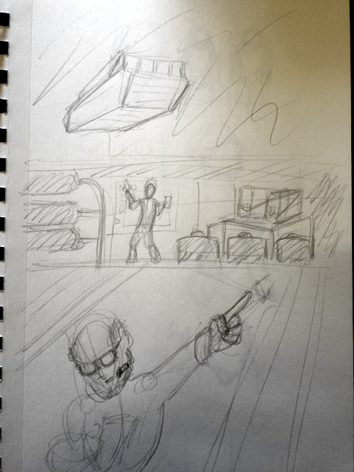
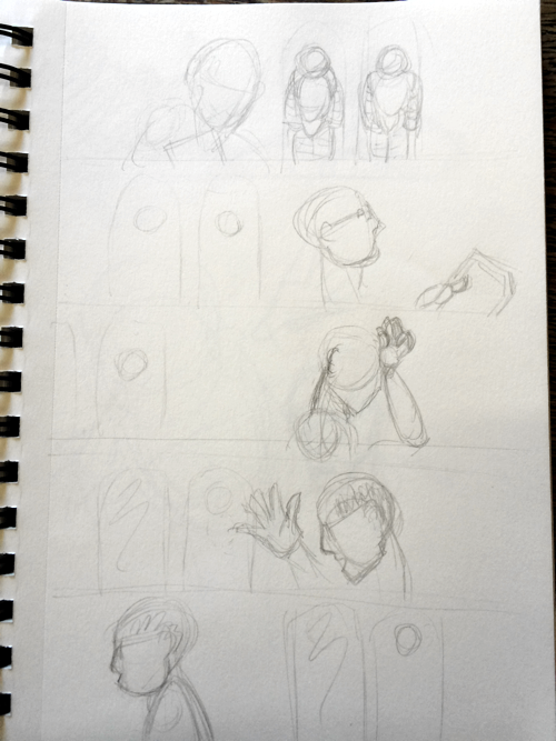
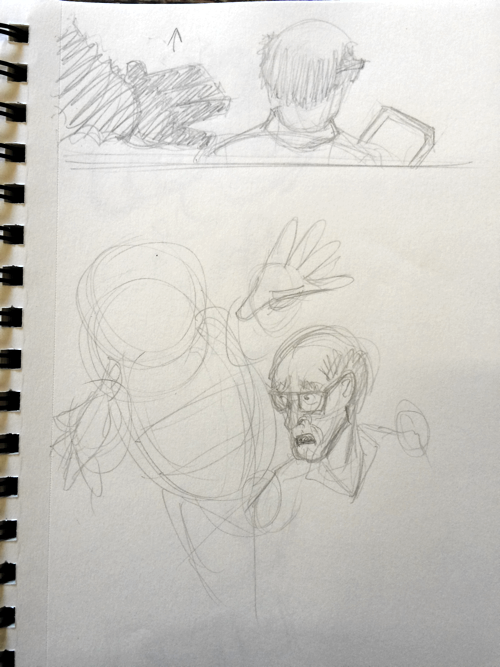
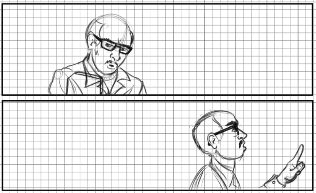
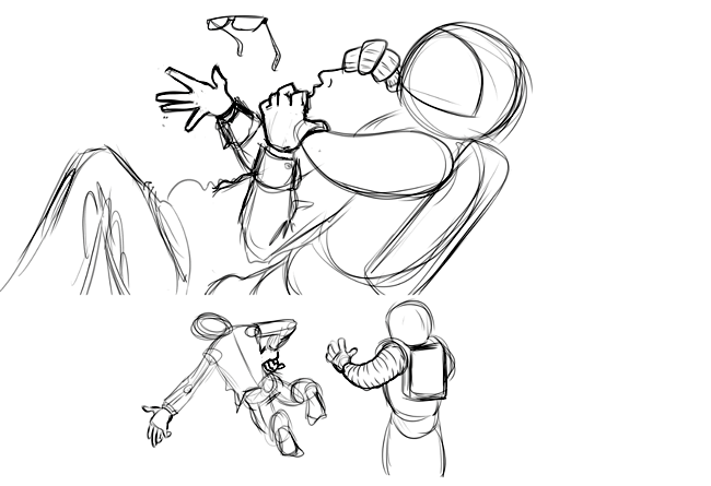
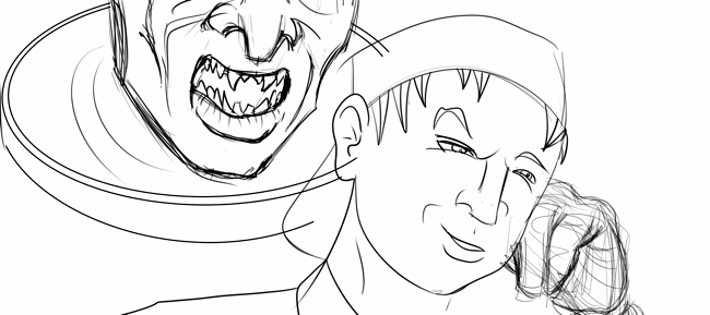
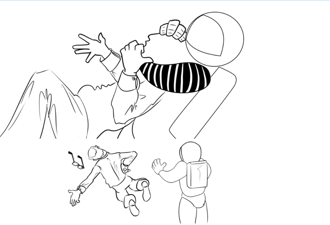
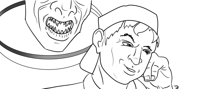
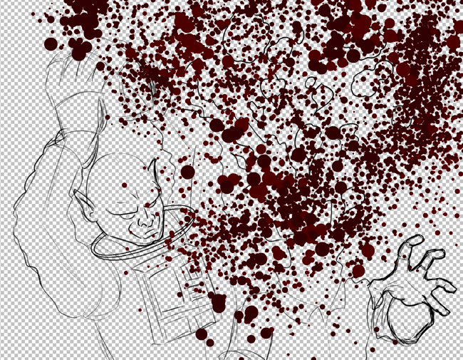
I started rough-sketching out the scenes with pencil and paper first, resulting in eight pages. Then I took photos of the sketches with my iPhone and imported them into Manga Studio on my Surface Pro. These are pretty terrible, but their primary purpose was to set up each scene. Here are a few:
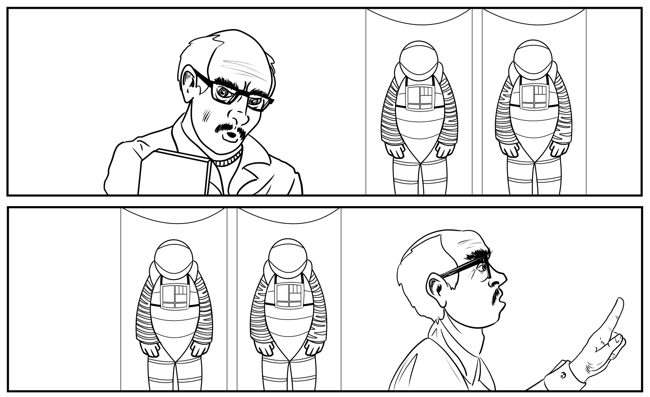
Using the sketches as guides, I started doing more detailed digital pencils on top, and then a final linework pass on top of those.
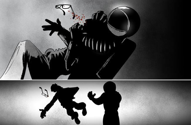
Now, a professional comic illustrator could probably bang out eight pages in just a few days. I, on the other hand, needed two months of on-again, off-again work to finish these pages. Sometimes I went a week or more without making progress on it. It's not a great way to work, partly because it was easy to forget important details such as what brush sizes I was using and what elements lived on what layer. Ah, and I did this while also holding down a day job and posting weekly comics at Neat Hobby. Luckily I had set the story in the dark, claustrophobic confines of a small spacecraft, so I didn't have to draw a ton of detailed environs because everything was in shadow or silhouette, saving me a ton of time.
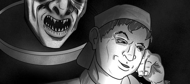
Eventually I had the linework done and could move on to inking. At first I was going to use a soft, airbrushed look but then stupidly changed my mind halfway through when I discovered this awesome Zombie Yeti rough brush, which I think gives everything a bit of a nightmare quality. In retrospect I probably put way too much detail into the linework since so much of it was swallowed up in shadow.
Finally I used some noise and fabric texture brushes to add some interest to the all-black areas.
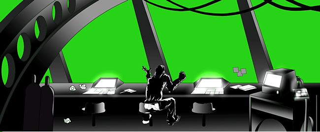
That's pretty much it for the illustration, just a lot of trial and error and pushing my drawing skills as far as possible. I redrew a lot of stuff, mostly the faces and hands. I redrew the entire shuttle bridge scene (frame one of page five) because I chose a line weight that felt too thick. The great thing about digital illustration, though, is you don't have to throw anything away. Just stuff the layers in a folder and hide them.
The "Enhanced Edition"
Two weeks before the publish date I read Matthew Bogart's "Why Cartoonists Might Want To Be William Castle" and Pablo Defendini's "Standards, Semantics, & Sequential Art." These immediately had me wondering if I could do anything with RED MOON to take it beyond static images. I'd seen animated/interactive comics before, and was particularly impressed by Electric Sheep Comix (NSFW) and Valve's Team Fortress comics. So I set out to add some cool special effects to RED MOON.
This didn't turn out to be as much work as you'd think. All of the effects are triggered by Skrollr, a JavaScript library that allows a web page to do special stuff when the page is scrolled. Check out the demo and you'll essentially see all the effects I used in RED MOON.
The other fancy part is the use of CSS3 transitions and animations. With these you can achieve Flash-style but with plain ol' CSS rules. These animations are usually managed by the host computer's graphics processor instead of the JavaScript engine, so they're less likely to bog down the page rendering.
Everything in RED MOON is done with Skrollr, CSS3 and a bit of native JavaScript. I didn't use even one line of jQuery. Some concrete examples:
• The flashing foreground lighting in page three is a partly transparent, absolutely-positioned PNG image, with a looping CSS 3 animation that toggles the overlay's CSS opacity value.
• The totally gross blood gusher is another partly transparent PNG image that starts off scaled down to almost nothing. As the page scrolls, the image is scaled up to where it appears to burst from the frame. This is done with the transform:scale CSS rule.
• The floating, spinning eyeglasses are another PNG image which is both scaled up and rotated as the page scrolls. There's also some positioning magic happening to keep the glasses somewhat centered in the window while you scroll. The fact that the glasses also disappear into shadow is a happy accident!
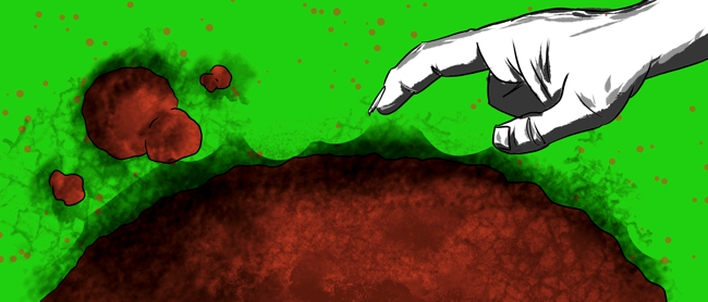
• All the star fields and blood particle backdrops are just CSS background images behind the page images, which have transparent knock-outs. I actually used a green screen layer so I could easily see where those knock-outs were.
The backdrops scroll independently of the page images, creating a cool parallax effect.
Finally, the dialogue balloons are transparent PNGs absolutely positioned on top of everything else. They begin hidden at zero opacity, and begin to fade in once they're within 100 pixels of the window centerline.
That is basically everything! To be honest, it took far longer to chop up all the images into floaty bits and position them on the page than it did to hook up the special effects. I ended up with lots and lots and lots of little image files to manage. A pain, but I think the result was totally worth it.
As a collection of web pages, RED MOON is neither responsive nor accessible, which kind of bothers me a bit. If I had more time before launch, I would've liked to at least come up with a better mobile solution. I think this is one of the bigger challenges facing comics today: how to take an art form that relies so much on layout to create mood, tension and cadence and translate it to mobile screens. Even the static image version isn't all that optimal for small screens as the images themselves are enormous -- and I didn't even provide high resolution images for Retina and other dense-pixel displays.
Ideally there'd be only one version of RED MOON that would be initially static images, with the JS/CSS-powered bells and whistles added only for browsers that supported them. In hindsight I can see a few ways I could have managed this, but I was rushing at breakneck speed just to finish the art, so I'll just try to do even better next time.
Thanks again for reading!
